
30. finding magic in branding
- smarti
- 12 minutes ago
- 7 min read

finding magic in branding © thesmarti
Jazzed on Grains is a company that makes small batch pasta from heritage old-school grains in Copenhagen, Denmark. The owner, Simone Schmid, is a go-getter who is always three steps ahead, racing towards a more conscionable future where real food matters to the people and to the planet. We've worked together on some amazing projects, and it's honestly been such a joy to return to her business time and again to help the company shine. For this blog post, I'm sharing the branding mural I illustrated to help her explain Jazzed On Grains products.

go back to the roots © thesmarti
Jazzed on Grains is the brain child of Simone and her former business partner Vibeke. Both journalists, and both searching for solutions for a multi-headed hydra: 1) how to unprocess foods 2) make food that's nutritiously dense and 3) replenish the soil, 4) heal the earth, etc. They started Jazzed On Grains as a small test kitchen to contract farmers to produce heritage grains that they could make into small batch pasta. While the goal was initially to sell to restaurants, the space quickly expanded as a six-seat cafe for walk-in purchases of pasta, toast and coffee.
Their space is in Nørrebro, Copenhagen - a 10min bike ride from our apartment when I lived in Denmark. Simone and I were introduced as friends, and then she quickly started letting me experiment with photography, chalk-painting, illustrations and designing. I have to be honest and admit that some of my attempts were absolute failures - my talents don't extend to portrait photography for example, and her preferred illustration style is ludically messy. But we still managed to have some fantastic adventures together - designing delivery tote bags and posters for pop-up events. I like supporting her and her businesss and I feel like the love is mutual.
So for this project, Simone asked me to help build an illustration comic-style that would explain what Jazzed On Grains actually do. I prepared a series of questions to help Simone catalyze the brand words, explain her illustration assets, and even explain why the company has "Jazzed" in the title. (It helps shake off the monoculture vibe. It's the opposite of commodified and boring.) Most importantly, she had recently done an interview with a documentarian to share a bit about the Jazzed on Grains concept, how it works and why it matters. I must have listened to the interview a hundred times while I started researching characters, concepts and other illustrations that would help capture the phases of the Jazzed On Grains pasta-making process.


Research sketches of grains, farmers, soil and milling process. © thesmarti
For the first stage, I sketched and set up three concepts. 1) based on blocks that isolate each stage of the process as separate slices. 2) diagonal circles from top right to bottom left that capture every big and small moment of the process, and 3) an Rube Goldberg machine version that shows how each process leads into the next.


Jazzed on Grains mural concept of 1) block slices, 2) diagonal circles, and 3) Goldberg machine © thesmarti
Neither of the concepts was quite right. So we made a compromise between the first and the third concept. And after I finished this blended concept, I moved forward into the inking stage. (I normally don't recommend blended concepts, but I was eager to get this project moving along.)
Then when we hit a major snag with the coloring. Jazzed on Grains plays a cheeky role as a disruptor in the mass-produced pasta lineup. The brand uses tie-dye backgrounds in the punk spirit of being extraordinary and revolutionary. So I gave Simone some thumbnail samples of the illustration colored with the tie-dye in the background. And we went back and forth over backgrounds. Her hesitation was a sign that there was actually a bigger problem we needed to tackle.


1) blue blended tie-dye coloring, 2) blue-purple-yellow tie-dye coloring and 3) pink tie-dye coloring © thesmarti
At first, we danced around some edits with colors, maybe some small inking changes that required me to go back to the drawing board. Eventually, the bubble burst and Simone pivoted hard and started showing me a dozen other illustration examples - completely different styles and concepts. I panicked and people-pleased - trying to see how I could salvage the illustration I worked so hard on.
Eventually we had a heart-to-heart and figured out what was actually wrong. The illustrations just weren't hitting the right tone. The grains weren't featured or elevated enough as a major player in the whole concept. The farmer was male, vintage-dressed and facing downward which felt symbolically sad and not at all progressive and modern. The milling stage looked foreboding and strange with the farmer's back to the audience. Simone even confessed that she felt squirmy about being featured as the model for the pasta-maker and instead relished her anonymity in the branding posts.
So we did something I probably would never do with another client. We took a big break and scratched the project. I felt so embarrassed and almost angry. It's silly but illustration feels incredibly personal in comparison to other creative projects. I put a little bit of my soul into everything I make and maybe because I'm still so naive - it feels painful to get it so wrong. I'm also not skilled at handling mission creep (when the client starts to request more than the original contract and I roll over like a St. Bernard.) Thankfully, I felt safe to push back with Simone and she was supportive and patient and gave me space for a couple of months to decompress from this failure. By the time we reconnected, I was ready to try again.
This round, I went back to the project with a bit more whimsy. I made two concept sketches - one with a comic style based on the last round of editing we had talked about. A kind of comic book page layout that would include close-ups and macro-shots with anime-style farmers and pasta-maker to make the whole piece feel and look different and be visually dynamic. And the other concept was based on magic.


v1) comic book page concept, v2) magic concept © thesmarti
I was in the process of rewatching the Harry Potter series, and so the second concept sketch, I took inspiration from all the magic and flying. For the opening scene, an elegant field of cows and bright sky set the scene for a variety of grain flourishing upward with an underground view of their strong roots. (Scenic- check. Playful - check. Grains and roots as major characters - check check.) Next: a farmer beans at the bouquet of grains in HER arms as another farmer carries a grain sack. (Modern - check. Both genders - check.) Then: the grain kernels fall into the mill uninhibited, flowing effortlessly into flour and directly into sacks. (Simple, smooth, and transparent process - check. check. check.) Next: the flour and water pour into the pasta-maker and crank out perfectly mixed pasta shapes onto trays. Each tray glides into a baking rack space to air-dry. (No person present - anonymity secured - check!) And finally: the pasta flies upward and into the branded pasta bags for Jazzed On Grains. (Reinforces branding, and small batches - check, check!) I rounded out the illustration with the words "Heritage Grain. Stone Milled. Small Batch. Danish Pasta." circling the pasta bags.
Simone loved the magic! Finally, the joy of the project was finally back at my fingertips. I felt delighted and buoyant. The next obstacle was just the sheer size of the canvas. The piece was meant to be a mural, but since I wouldn't be able to make it back to Copenhagen to paint it, we decided to make it into a print. In order to make sure that it would have sufficient detail and painted depth, I made the canvas ridiculously large. Immediately, the buoyancy joy bubble popped and I was back in the trenches, inking out lines for what felt like weeks.


1) first painted scene, 2) painting the whole background color, and 3) adding in the details © thesmarti
Eventually, enough of the lines were down and I could start painting in Procreate. I experimented with brushes and tried to mix values in colors to give the opening scene some vibrancy and texture. And then again, I was back in the trenches and painting with either boredom or panic. Because the canvas was so big, I could only keep 4 layers open. That meant, I needed to actually paint every little nuance instead of canvas splashing and using a clip mask on everything. So I set to work painting in stages. Every week, I'd send updates which sometimes didn't look very different from the last post despite all the details and clean-up effort.
After spinning my wheels for a month, I lost patience and just painted the whole background. And once I did that, I instantly felt more confident about the rest of the painting. Now, why didn't I do that in the first place? Definitely a trick to keep in my pocket for next time. Each cutout was made to be rugged and misshapen to symbolize the down-to-earth nature of Jazzed on Grains. And the organic layout and wonky shaping helped me loosen up and keep the joy as the painting stage continued for a couple more weeks.

1) first version, 2) comic version, 3) magic version and 4) final version © thesmarti
Before I shared the final painting, I sent an email to Simone to just recap the whole journey we had been on with this project. I shared the first concept, the comic page concept and the final concept as well as the final painting. All lined up, the process looks so simplified, when really it took a lot of twists and turns to make the final illustration.
A couple of quick tweaks on the farmers to modernize - feature a brunette instead of a blonde, make her sport a rock tee shirt and cap the other farmer with a bucket hat - and the project was complete.


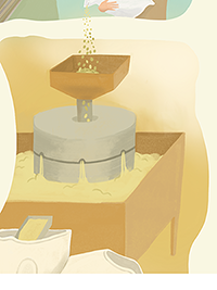


1) final poster, 2) pasta machine detail, 3) milling stone detail 4) pasta drying detail © thesmarti
When you walk into Jazzed On Grains, this giant illustrated poster is hanging on the wall. It's also part of a branding postcard that explain the company concept and products. I expect small pieces to pop up every now and again with this in branding bits and bobs as the Jazzed on Grains dances onward in their mission to make real food that counts. And I'm so grateful to learn so much with this project as well as to contribute to their progress.
cheers to finding the magic in each project,
smarti
Comments