
- 2 days ago
- 7 min read

finding magic in branding © thesmarti
Jazzed on Grains is a company that makes small batch pasta from heritage old-school grains in Copenhagen, Denmark. The owner, Simone Schmid, is a go-getter who is always three steps ahead, racing towards a more conscionable future where real food matters to the people and to the planet. We've worked together on some amazing projects, and it's honestly been such a joy to return to her business time and again to help the company shine. For this blog post, I'm sharing the branding mural I illustrated to help her explain Jazzed On Grains products.

go back to the roots © thesmarti
Jazzed on Grains is the brain child of Simone and her former business partner Vibeke. Both journalists, and both searching for solutions for a multi-headed hydra: 1) how to unprocess foods 2) make food that's nutritiously dense and 3) replenish the soil, 4) heal the earth, etc. They started Jazzed On Grains as a small test kitchen to contract farmers to produce heritage grains that they could make into small batch pasta. While the goal was initially to sell to restaurants, the space quickly expanded as a six-seat cafe for walk-in purchases of pasta, toast and coffee.
Their space is in Nørrebro, Copenhagen - a 10min bike ride from our apartment when I lived in Denmark. Simone and I were introduced as friends, and then she quickly started letting me experiment with photography, chalk-painting, illustrations and designing. I have to be honest and admit that some of my attempts were absolute failures - my talents don't extend to portrait photography for example, and her preferred illustration style is ludically messy. But we still managed to have some fantastic adventures together - designing delivery tote bags and posters for pop-up events. I like supporting her and her businesss and I feel like the love is mutual.
So for this project, Simone asked me to help build an illustration comic-style that would explain what Jazzed On Grains actually do. I prepared a series of questions to help Simone catalyze the brand words, explain her illustration assets, and even explain why the company has "Jazzed" in the title. (It helps shake off the monoculture vibe. It's the opposite of commodified and boring.) Most importantly, she had recently done an interview with a documentarian to share a bit about the Jazzed on Grains concept, how it works and why it matters. I must have listened to the interview a hundred times while I started researching characters, concepts and other illustrations that would help capture the phases of the Jazzed On Grains pasta-making process.


Research sketches of grains, farmers, soil and milling process. © thesmarti
For the first stage, I sketched and set up three concepts. 1) based on blocks that isolate each stage of the process as separate slices. 2) diagonal circles from top right to bottom left that capture every big and small moment of the process, and 3) an Rube Goldberg machine version that shows how each process leads into the next.


Jazzed on Grains mural concept of 1) block slices, 2) diagonal circles, and 3) Goldberg machine © thesmarti
Neither of the concepts was quite right. So we made a compromise between the first and the third concept. And after I finished this blended concept, I moved forward into the inking stage. (I normally don't recommend blended concepts, but I was eager to get this project moving along.)
Then when we hit a major snag with the coloring. Jazzed on Grains plays a cheeky role as a disruptor in the mass-produced pasta lineup. The brand uses tie-dye backgrounds in the punk spirit of being extraordinary and revolutionary. So I gave Simone some thumbnail samples of the illustration colored with the tie-dye in the background. And we went back and forth over backgrounds. Her hesitation was a sign that there was actually a bigger problem we needed to tackle.


1) blue blended tie-dye coloring, 2) blue-purple-yellow tie-dye coloring and 3) pink tie-dye coloring © thesmarti
At first, we danced around some edits with colors, maybe some small inking changes that required me to go back to the drawing board. Eventually, the bubble burst and Simone pivoted hard and started showing me a dozen other illustration examples - completely different styles and concepts. I panicked and people-pleased - trying to see how I could salvage the illustration I worked so hard on.
Eventually we had a heart-to-heart and figured out what was actually wrong. The illustrations just weren't hitting the right tone. The grains weren't featured or elevated enough as a major player in the whole concept. The farmer was male, vintage-dressed and facing downward which felt symbolically sad and not at all progressive and modern. The milling stage looked foreboding and strange with the farmer's back to the audience. Simone even confessed that she felt squirmy about being featured as the model for the pasta-maker and instead relished her anonymity in the branding posts.
So we did something I probably would never do with another client. We took a big break and scratched the project. I felt so embarrassed and almost angry. It's silly but illustration feels incredibly personal in comparison to other creative projects. I put a little bit of my soul into everything I make and maybe because I'm still so naive - it feels painful to get it so wrong. I'm also not skilled at handling mission creep (when the client starts to request more than the original contract and I roll over like a St. Bernard.) Thankfully, I felt safe to push back with Simone and she was supportive and patient and gave me space for a couple of months to decompress from this failure. By the time we reconnected, I was ready to try again.
This round, I went back to the project with a bit more whimsy. I made two concept sketches - one with a comic style based on the last round of editing we had talked about. A kind of comic book page layout that would include close-ups and macro-shots with anime-style farmers and pasta-maker to make the whole piece feel and look different and be visually dynamic. And the other concept was based on magic.


v1) comic book page concept, v2) magic concept © thesmarti
I was in the process of rewatching the Harry Potter series, and so the second concept sketch, I took inspiration from all the magic and flying. For the opening scene, an elegant field of cows and bright sky set the scene for a variety of grain flourishing upward with an underground view of their strong roots. (Scenic- check. Playful - check. Grains and roots as major characters - check check.) Next: a farmer beans at the bouquet of grains in HER arms as another farmer carries a grain sack. (Modern - check. Both genders - check.) Then: the grain kernels fall into the mill uninhibited, flowing effortlessly into flour and directly into sacks. (Simple, smooth, and transparent process - check. check. check.) Next: the flour and water pour into the pasta-maker and crank out perfectly mixed pasta shapes onto trays. Each tray glides into a baking rack space to air-dry. (No person present - anonymity secured - check!) And finally: the pasta flies upward and into the branded pasta bags for Jazzed On Grains. (Reinforces branding, and small batches - check, check!) I rounded out the illustration with the words "Heritage Grain. Stone Milled. Small Batch. Danish Pasta." circling the pasta bags.
Simone loved the magic! Finally, the joy of the project was finally back at my fingertips. I felt delighted and buoyant. The next obstacle was just the sheer size of the canvas. The piece was meant to be a mural, but since I wouldn't be able to make it back to Copenhagen to paint it, we decided to make it into a print. In order to make sure that it would have sufficient detail and painted depth, I made the canvas ridiculously large. Immediately, the buoyancy joy bubble popped and I was back in the trenches, inking out lines for what felt like weeks.


1) first painted scene, 2) painting the whole background color, and 3) adding in the details © thesmarti
Eventually, enough of the lines were down and I could start painting in Procreate. I experimented with brushes and tried to mix values in colors to give the opening scene some vibrancy and texture. And then again, I was back in the trenches and painting with either boredom or panic. Because the canvas was so big, I could only keep 4 layers open. That meant, I needed to actually paint every little nuance instead of canvas splashing and using a clip mask on everything. So I set to work painting in stages. Every week, I'd send updates which sometimes didn't look very different from the last post despite all the details and clean-up effort.
After spinning my wheels for a month, I lost patience and just painted the whole background. And once I did that, I instantly felt more confident about the rest of the painting. Now, why didn't I do that in the first place? Definitely a trick to keep in my pocket for next time. Each cutout was made to be rugged and misshapen to symbolize the down-to-earth nature of Jazzed on Grains. And the organic layout and wonky shaping helped me loosen up and keep the joy as the painting stage continued for a couple more weeks.

1) first version, 2) comic version, 3) magic version and 4) final version © thesmarti
Before I shared the final painting, I sent an email to Simone to just recap the whole journey we had been on with this project. I shared the first concept, the comic page concept and the final concept as well as the final painting. All lined up, the process looks so simplified, when really it took a lot of twists and turns to make the final illustration.
A couple of quick tweaks on the farmers to modernize - feature a brunette instead of a blonde, make her sport a rock tee shirt and cap the other farmer with a bucket hat - and the project was complete.


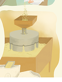


1) final poster, 2) pasta machine detail, 3) milling stone detail 4) pasta drying detail © thesmarti
When you walk into Jazzed On Grains, this giant illustrated poster is hanging on the wall. It's also part of a branding postcard that explain the company concept and products. I expect small pieces to pop up every now and again with this in branding bits and bobs as the Jazzed on Grains dances onward in their mission to make real food that counts. And I'm so grateful to learn so much with this project as well as to contribute to their progress.
cheers to finding the magic in each project,
smarti
- Mar 14
- 7 min read
Updated: 2 days ago

I'm retraining my running legs for the Cape Town 2 Oceans Half Marathon in April. I say retraining because I used to be a runner but I've lost the running skill since being in Windhoek. I got inspired to race again so it's back to the basics and remembering how to put one foot in front of the other in the hot climate of Namibia.

Running is definitely a skill. We all run around as kids, but once you grow up there's definitely a learning curve to finding the rhythm. I remember learning to run with my dad in the 7th grade. We would jog/walk the trek to the end of the road. A mille there. A mile back. 2 measly miles. And every time I remember being winded, cramped, overwhelmed and strangely embarrassed. (It was middle school.) But then it slowly got easier. Eventually, running was just another part of land training for high school swimming and college rowing.
In graduate school in Denver, Colorado, running took on a new dimension for me as an extreme escape from my grueling studies. I started running longer and longer distances and learned how to train for a marathon through the Leukemia and Lymphoma Team in Training (TNT). Over the years, I've completed 5 marathons, and then my first ultra - the Cape Town 2 Oceans Marathon. (Technically the 56k is just a little beyond the normal marathon distance of 42k. So....a mini ultra. Still counts though.) That race was epic and wonderful and rivaled the beauty of the Big Sur marathon back in the USA. And I've been running on and off for pleasure ever since.
Before we get any further, let me just admit that I was NEVER fast. Like ever. I just enjoyed the feeling, the meditative repetition, the peaceful routes, the way my whole body felt shimmery after a good run. I loved leaving everything behind. The breeze in my face, the swish of my ponytail, the cooling sensation of a good sweat. I enjoyed planning my runs when I was single. I enjoyed running with my partner when we got together. And I enjoyed running in every new destination we've been assigned to since.
So why did I stop running in Windhoek? Well, let me count the ways. First of all, there aren't dedicated sidewalks, so you have to run on the gravel mix and dirt alongside the road and high-fenced properties, sometimes at some really awkward angles. (See a video of the sidewalks here for example.) Parks are mostly sand, rocks and open african bush so it's just...not very nice. Second, it's crazy hot for most of the day so you have to go really early or wait until the sun is going down. Since mornings are just not for me, I always found it tricky to run at the end of the day when I'm in a groove with work. Third and most-distressing - I was warned so many times about not running. Don't run alone. Don't run with headphones. Someone got mugged there. Don't run on this street, this neighborhood or that area. It's not safe. It's not safe. It's not safe. It's really hard as an outsider to judge the crime and safety of a new place. Even more so as a female. It was frustrating and uncomfortable. So...I just gave up.

I didn't realize that when I stopped running I would lose my cardio strength. I mean, duh. But I just thought that my other training (yoga, weight-lifting, swimming, stair-stepper) would keep my cardio in check somehow? I deluded myself into thinking it would be ok even though I know no other cardio compares. So, when someone brought up the 2 Oceans Marathon - I thought, that might be fun to do again. I don't think I want to do full marathons anymore, but the half could be cool. So I dusted off an old schedule and started to train.
And then I went for my first run. And it was awful. My legs burned, my lungs hurt, and I felt so ashamed when I had to walk at some points. There's something really humbling about running. You can't fake your strength. You can't trick your breathing. You can't push through your pain. You have to just huff and puff and walk and hurt all the way, until after some repetition it starts to feel easier. And then running will even start to feel good. The actual joy of running doesn't click in until much later in the training...which is probably why so many people hate it.
So I got through that run, and the next, and the next. Mostly through grit, but also with patience because I knew the ease of running would eventually come back. I had to just wallow in the frustrating part and just keep putting one foot in front of the other. What a life lesson. It's so simple and so difficult at the same time. It's also interesting how the repetition itself is what pulls you through to the next stage. You can't think your way through it, you just have to be in pain and live with it and repeat, repeat, repeat until eventually the pain is still there, but somehow you are moving gracefully through it.
And now I'm running three times a week and its starting to feel good again. Unfortunately, I do a lot of my runs on a treadmill because it's convenient. I know that's cheating since the track wheel is doing some of the momentum work. But I always put it at 1.0 incline, and try to push my pace to test faster speeds. Getting on the treadmill is easier each time, but the pacing feels like a manageable challenge. I feel like I'm getting stronger V02 capacity because my breathing rhythm is easier to manage at these faster paces.
I try to also run a couple of routes in the neighborhood from time to time. I know I'm testing the limits of my safety, but it's so different running outside that it's really helpful for training. I'm a bit of a lone wolf when I go because I don't have running friends yet, and even if I did it's hard to schedule or pace with others. Such is life. I do my best to vary the routes, and greet every dog-walker I come across so I know someone has seen me.
On the weekends, I'm lucky to have my partner join me for longer distance runs as we zig-zag through the city. We planned out a couple of routes and just add a bit more to each route to make it long enough for the training. I even bought a running vest for these longer runs, which I actually don't enjoy wearing since it scratches me up, but we've kept the silicone water pouches and found a way to run with those. I've been filling them with electrolyte mixes since the long runs in the heat here can really sap the energy out of the legs.
Here's what I'm learning about running in Windhoek:
mark an oil line all the way around the top edge of the ankle above your sock to catch some of the gravel and sand before it goes down your shoes
heel-lock the laces on your shoes to prevent the most egregious blisters while scaling hills (here's a really quick video that explains how to heel-lock.)
track the UV index for the right time to go out for your run (approx. 2 hours before sunset) for when the desert sun is less dangerous to the skin
brace yourself for barking behind every fence you pass - dogs are trained in Windhoek to be crime-defense animals
prepare to run alone because scheduling will make it tricky to join others. Send an sms to a friend with a screen capture of the route and your departure time and leave the phone at home. Once you get back, send an sms so no one has to send out a search party.
prepare for the boredom because headphones are *likely mugging target so memorize a poem, or think through a puzzle, or just focus on your breathing and let your mind wander

cross-training, weight-lifthing, swimming and running in Windhoek © thesmarti
As the weekend routes expand, I'm finding that I'm able to switch off the brain and just cruise. I still wish I could listen to music or podcasts for these outdoor runs, as it's such a helpful distraction when the runs are long or when there's too much stimulation. But at least I get to watch something on the treadmills - I like to program action adventure movies for anything longer than 30min, and its always a lot of fun to get caught up in the story and forget I'm even running!
I'm also realizing how great these Windhoek hills are for training. It's super hilly here. (Maybe that's why it was so humbling when I restarted training?) These hills really up the ante - a daunting challenge for any athlete. It takes a lot more exertion in muscles and lung capacity to climb the incline. I just lower my eyes and focus downwards on keeping pace until we've crested the top. And then I'm always grateful to coast down.
I'm not sure I'll race much beyond this next half marathon. But I'm definitely keeping these running legs now that I've made such an effort to earn them back. I'm getting to the point where some days the runs do feel glorious with the warm breeze and open skies, the crunch of the gravel and the anonymity of being the only one on the road. I think I'll find more joy for running in Windhoek as time goes along. For now, I'm just glad I'm back on my feet.
cheers to keeping or retraining your running legs,
smarti
- Feb 14
- 4 min read
Updated: 2 days ago

Mexican paradise map-making © thesmarti
I made a friend in Copenhagen while learning Danish. Online. Covid times, amiright? We had such a fun energy together, and I learned she was also a graphic designer. So during breakout sessions, I would gush over new design projects with her. Many adventures later, I was overjoyed when she looped me in to help illustrate a map for a Mexican paradise.
--
A couple of years ago, Karla Cifuentes landed a dream role for the design and promotion of the Careyes website. It's classy and sweeping with gorgeous photos and killer aerial shots of palms and bright colorful architecture. When the time was right, she pulled me in to build the map and customize some illustrations. Her goal was to make a responsive map with iconic key spots illustrated. Then the map would have pop-outs that direct people to the real estate options.
Part One was the map foundation. I patched google maps together, aerial shots. I studied drone photo shoots and tried to cobble together some understanding of the area. (It's really hard to map a place you've never been to.) I wanted to make sure the map was precise to the coastline so this required outlining pixelated photos and double-checking landmarks over GPS mapping for scale accuracy. It was tedious and frustrating, but had to be done. This took months because I dragged my feet on it. Thankfully Karla was patient.


1) Reference photo googlemaps for Careyes, 2) my first outline attempt and 3) multi-layer final map design © thesmarti
Eventually I submitted the map layout and Karla and I went back and forth on the coastal areas - some places were actually less beach - like Playa Teopa which is actually more brush than is shown on aerial photographs, and some cliffsides drop immediately into the ocean. I was grateful for Karla's expertise in the area. We also tried to highlight topographical depth in Careyitos Beach and Playa Rosa. To synchronize the colors, Karla covered over a lot of the forest area with some watercolor patches in dark green to emphasize the jungle density. The map foundation eventually culminated into this:

Explore the Territory Map - ?! Careyes - © Karla Cifuentes
Part two of the project was illustrating the iconic landmarks. Oh the joy of the research! Hunting out eccentric houses in bright colors, blue pools, lush landscaping - I had help with the drone photos from Karla's files. But the pieces featured on Pinterest and through online searches slipped me into some surreal fantasies of living the tropical life. Ah, Mexico - they really know how to play with color, and the architecture of Careyes is so bizarre and fun! Karla had to color correct me on some of the illustrations - house colors have been updated since their original debut. Karla wanted a watercolor look, so despite everything being sun-drenched and vibrant, I tried to stay light on intensity.
Actually, my bigger pickle was finding a way to draw these hot spots at an angle despite having reference photos that were either aerial or face-front. I spent way too much time building perspective lines, testing to see if the angles were right, and trying to add just enough detail to capture their essence. Again, it's really hard to paint something without seeing it in person. All my regular tricks of judgement and measurements went sideways until I finally got one illustration right and then started building the rest of them using the same perspective-line tools.


1) illustration of Careyes Club © thesmarti, 2) Careyes Club photo refernce © Karla Cifuentes, 3) illustration of Sol Occidente © thesmarti
And once we had some illustrations in the bag, we brainstormed a B-list of local hot spots and nearby marine life to help fill out the map. At this point I was just having a blast, zipping through sketches, and then coloring and shading with natural facility and ease. It's funny how sometimes projects can end with a bang like that. Here are some of my favorites from the complete set:


Illustrations of 1) manta ray, 2) centro del universo, 3) mi ojo iconic rocks, 4) copa del sol, 5) pueblo careyes, and 6) whale © thesmarti
After the project wrapped, it took a while to get paid. That's a whole other story, but it deserves a side note: a deposit upfront can help you sort through potential financial snafus before the project even launches. Lesson learned. But it was fun to work with my friend and draw naively in paradise for a while. And I'm glad the project was successful, and its serving its puprose to introduce people to the fantastic mexican paradise of ?! Careyes.

Karla is using a mapping software that allows a responsive interaction. On the website: https://careyes.com just click on Explore the Territory so you can see the map live. You can click on the different pins on the map to see the true photographs, or you can just pinch or zoom in to see the different illustrations I contributed to the final piece.
Cheers to a paradise project with a friend,
smarti


